शेखर

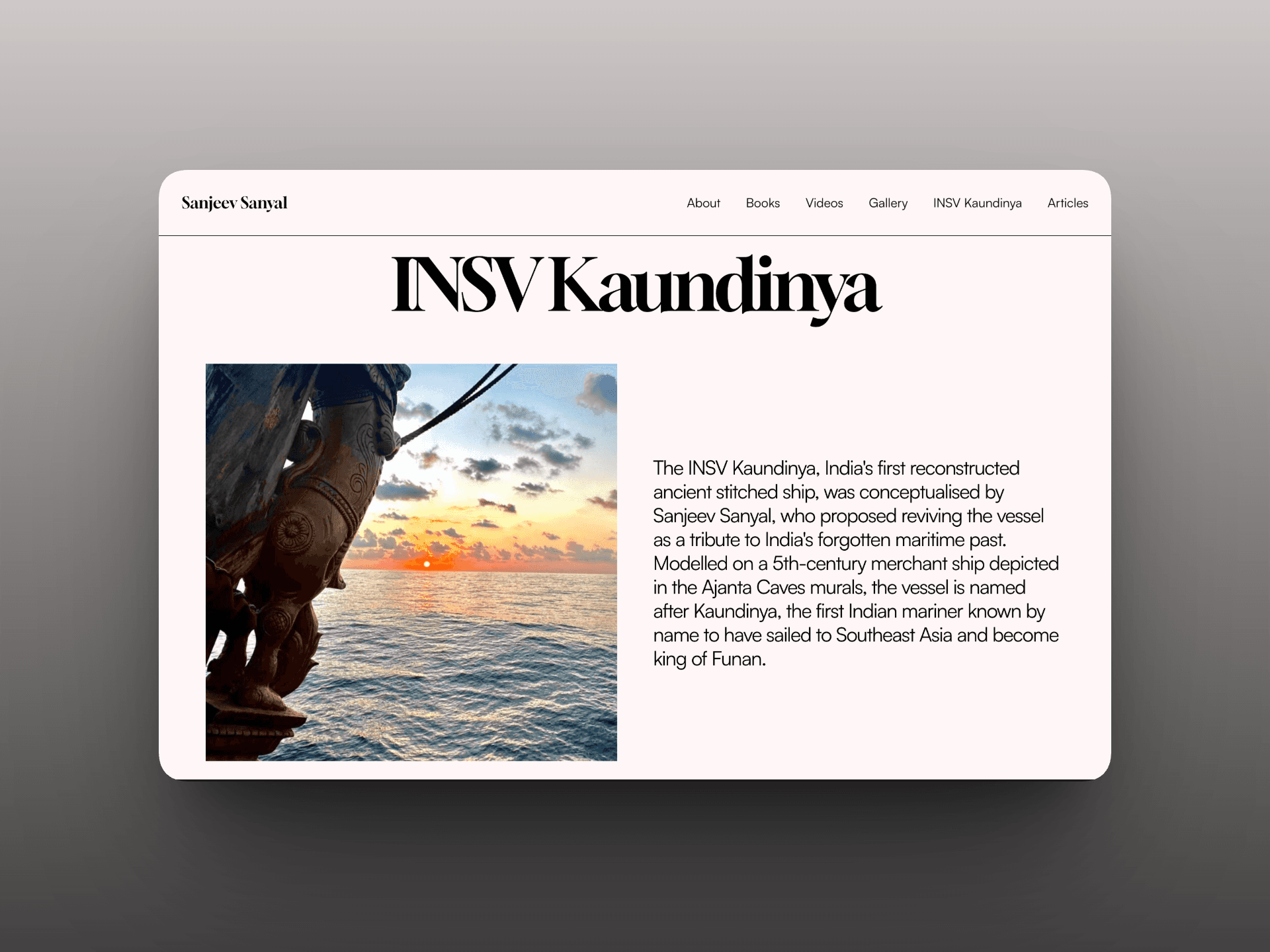
Sanjeev Sanyal's personal website was redesigned around one core brief: keep things as simple as possible. The challenge was to bring decades of writing, research, books, and videos into one clear experience without making the breadth of the content feel complicated, while giving the site a robust foundation that could continue to grow.
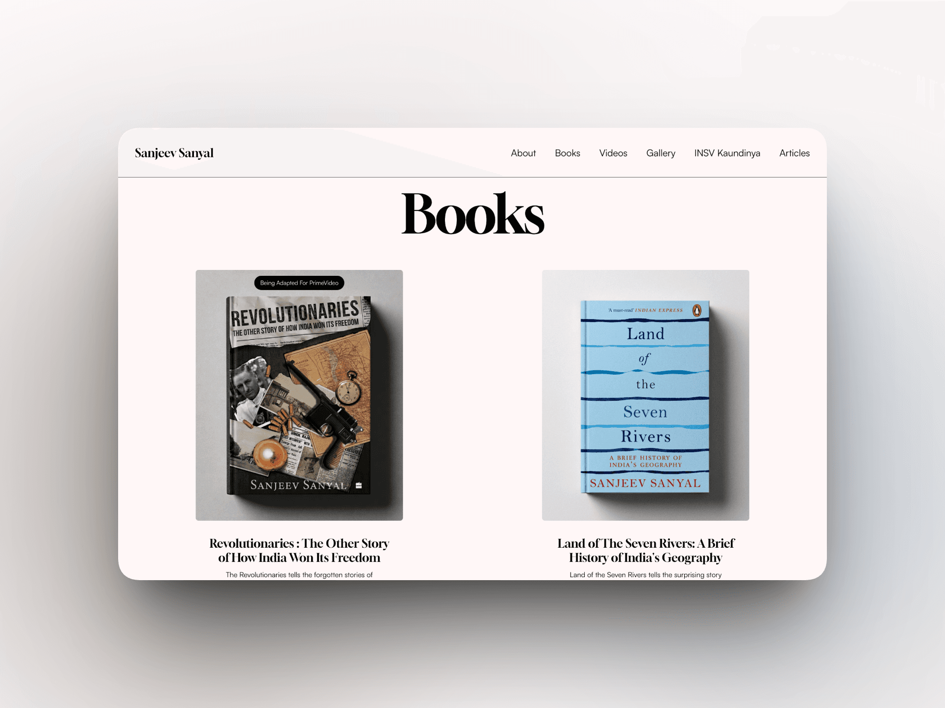
The new structure introduced a dedicated interactive books section, giving each title more room to be discovered and explored, alongside a focused videos section for talks, interviews, and other appearances. Behind it all, a robust content management system was built and populated through the migration of 200+ existing items, with a flexible structure designed to scale easily as new work is added.
In the first month after launch, the new site saw roughly 20× more visitors than the previous site. More than increasing traffic, the redesign made Sanyal's work substantially easier to discover and explore, turning a large and varied body of content into a simpler, more accessible experience without losing the depth of what the site needed to hold.